Somber
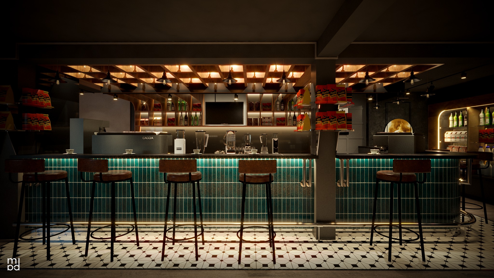
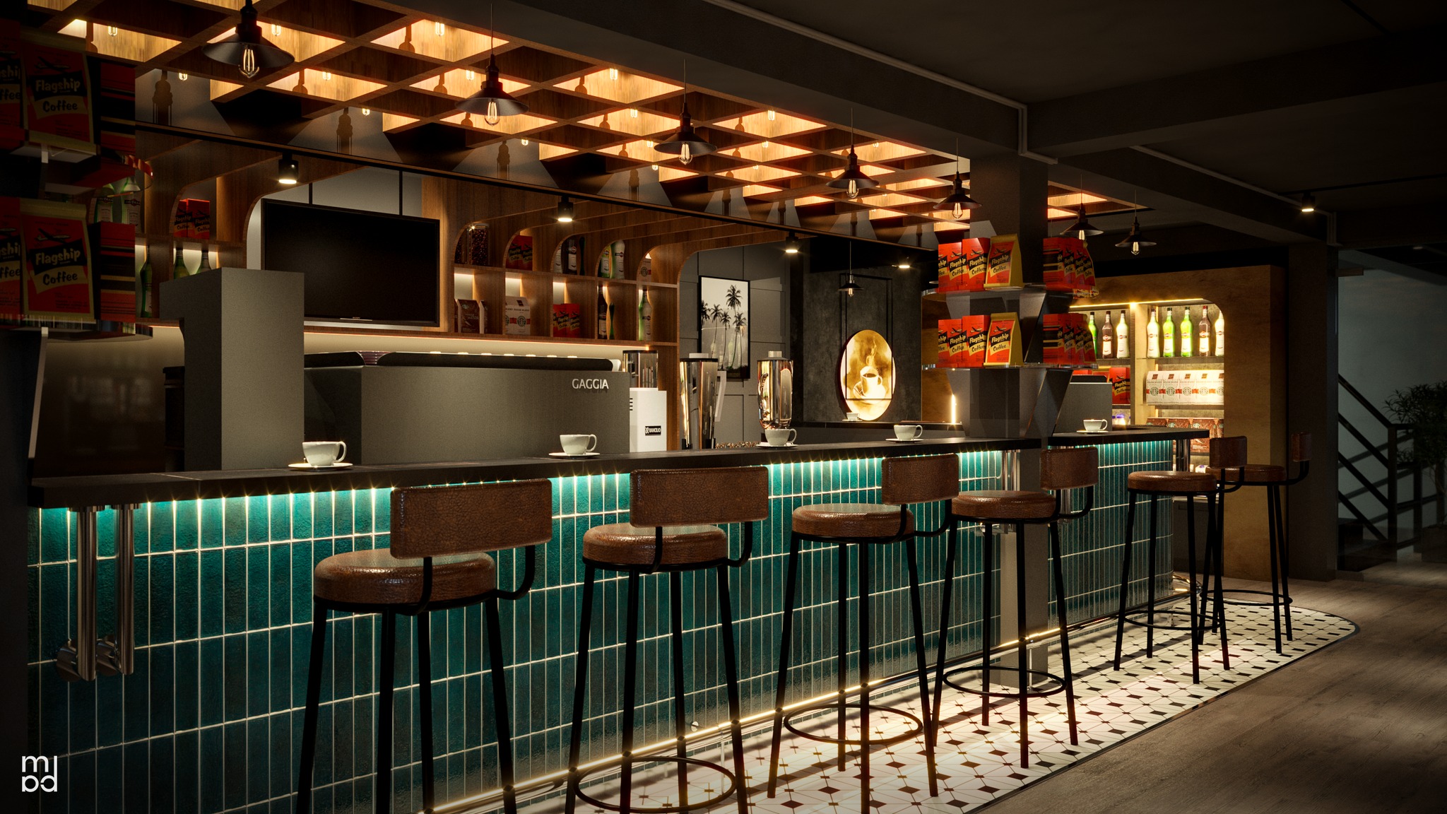
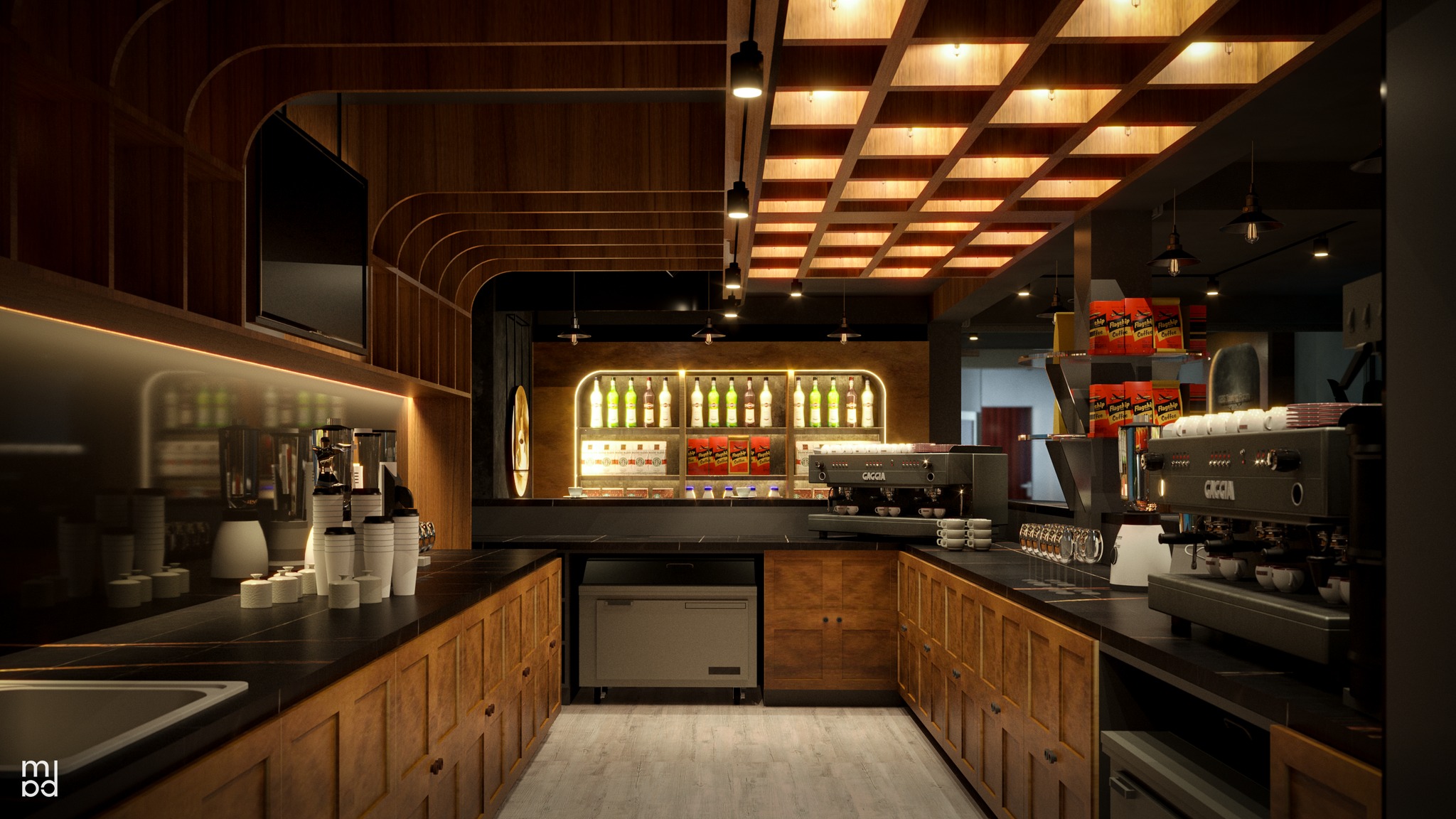
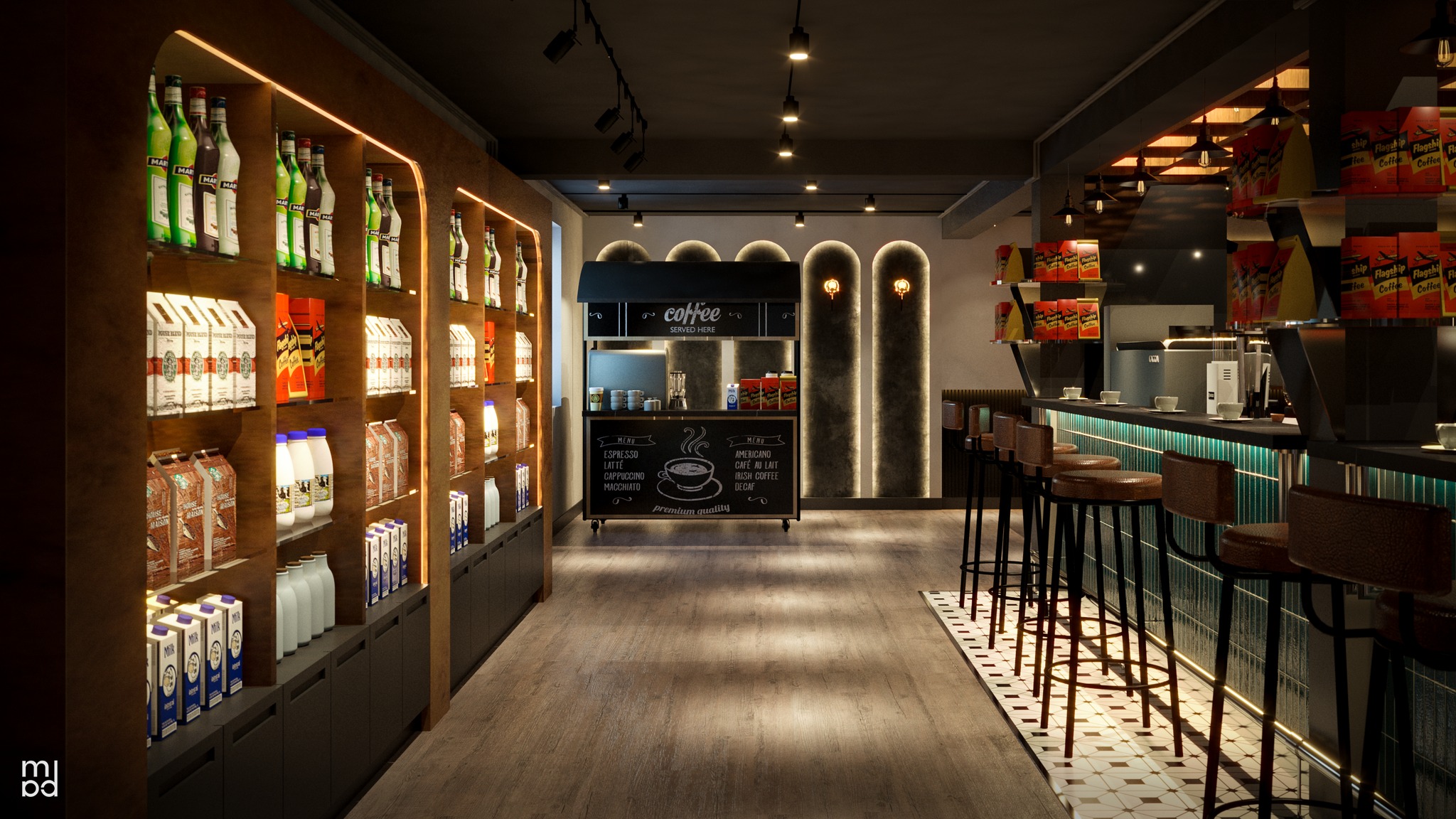
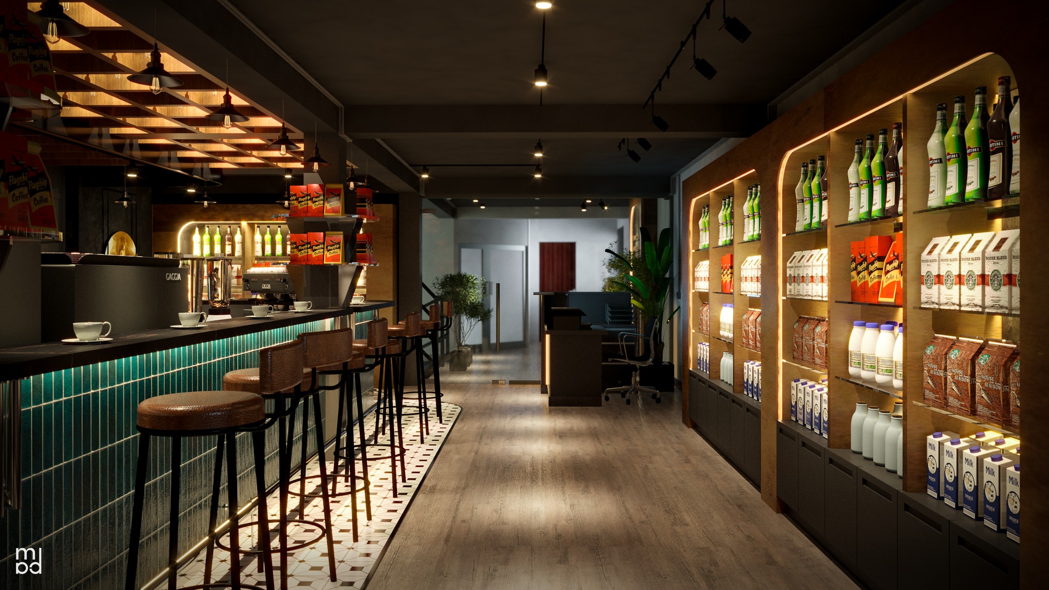
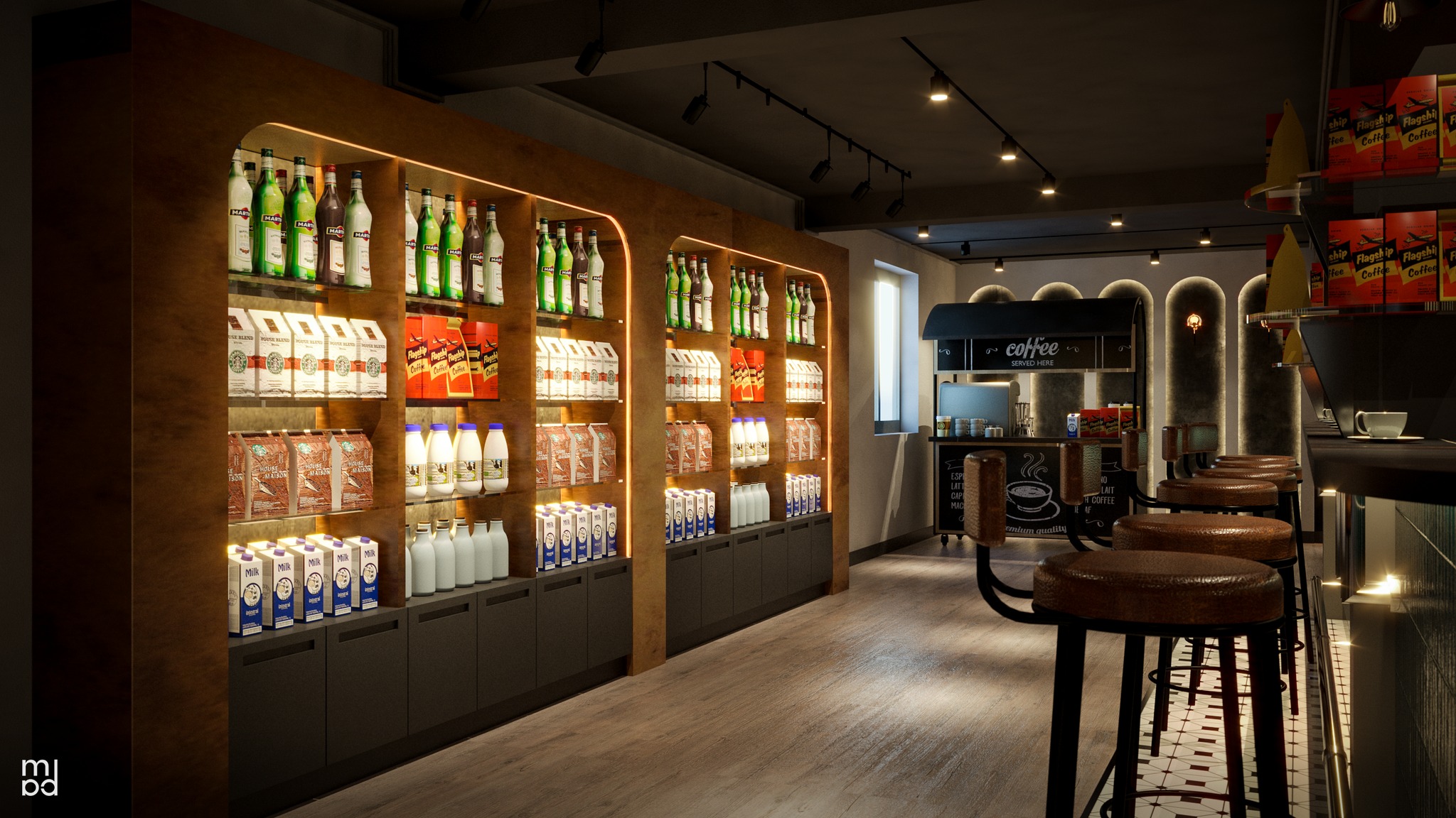
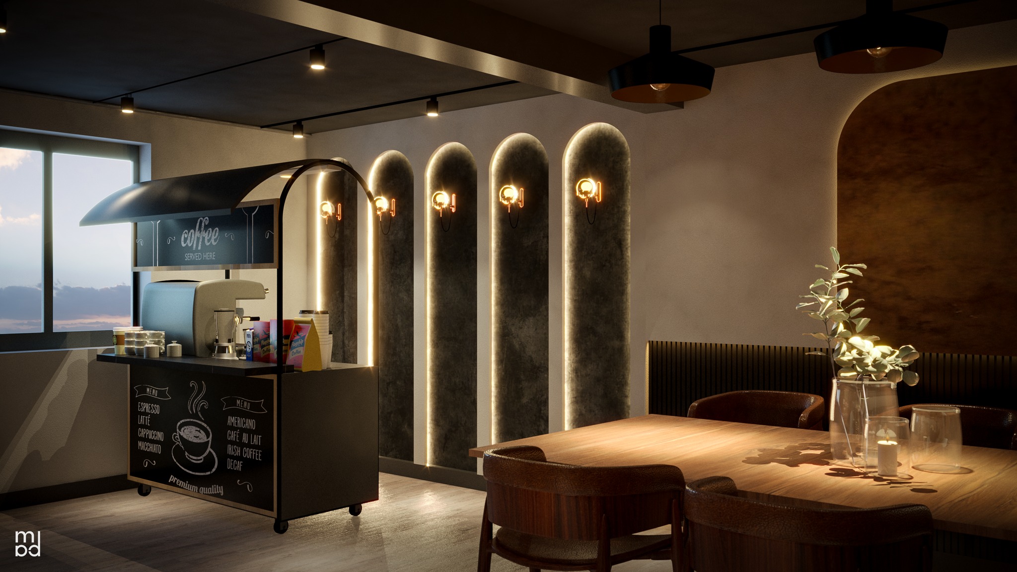
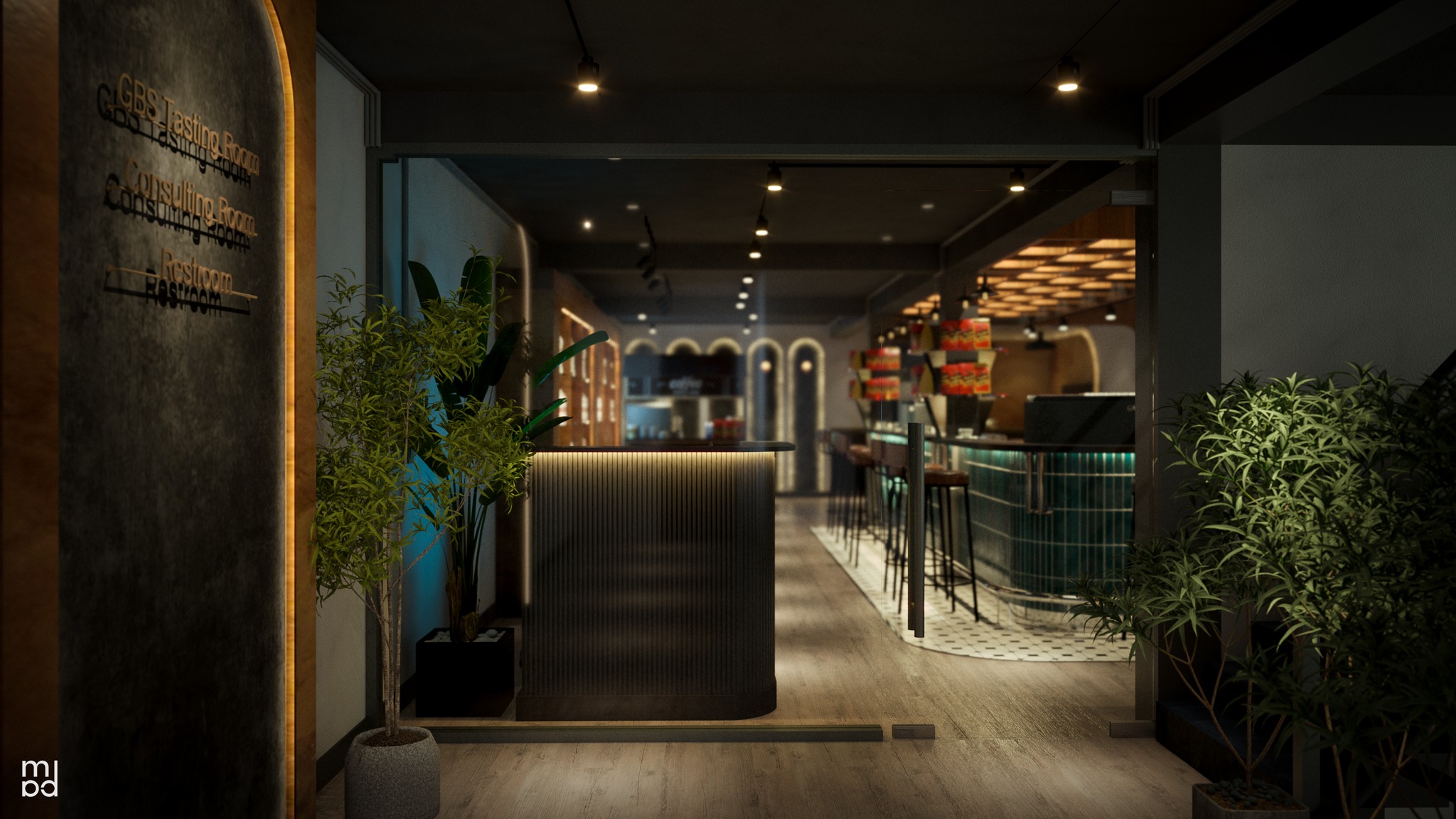
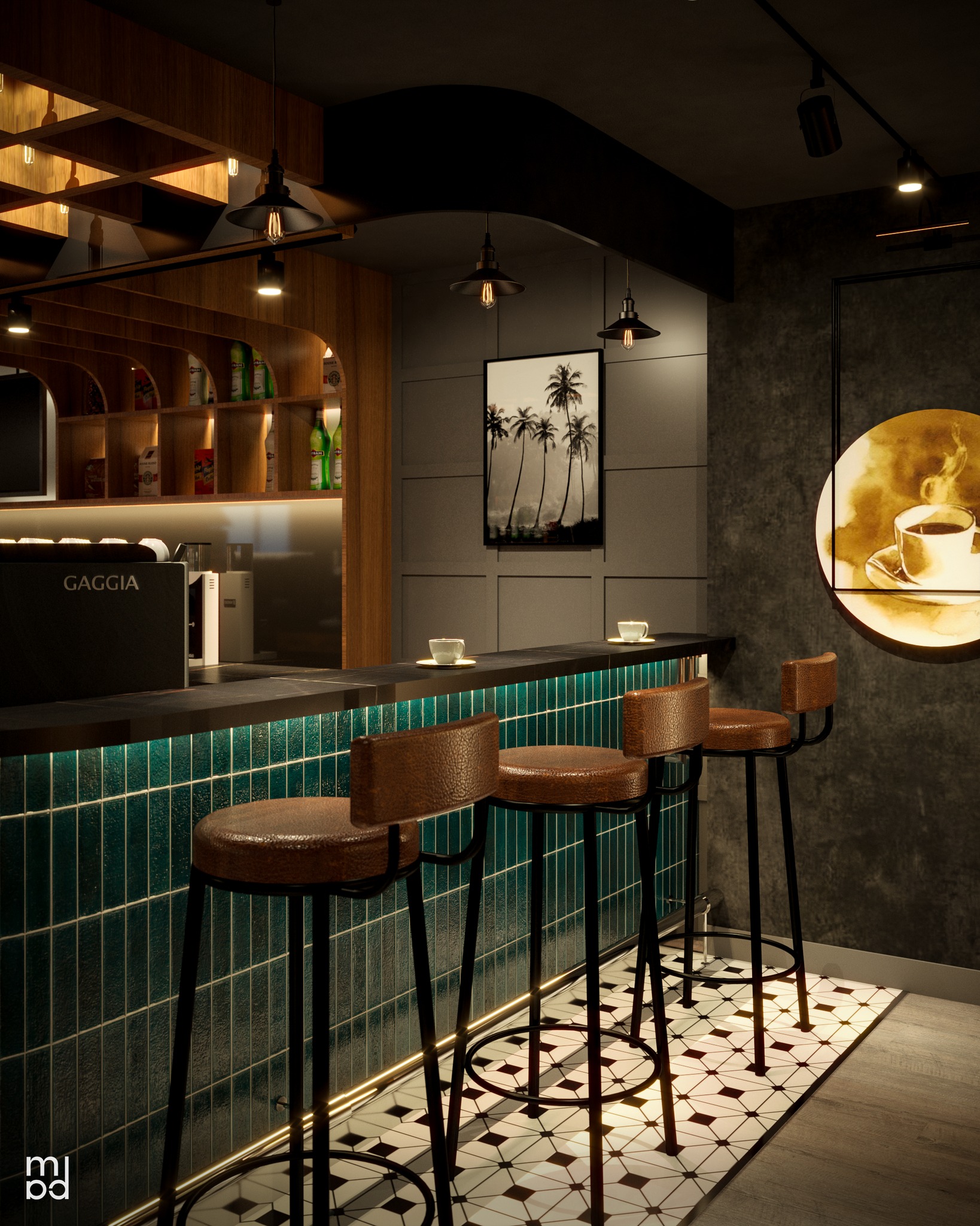
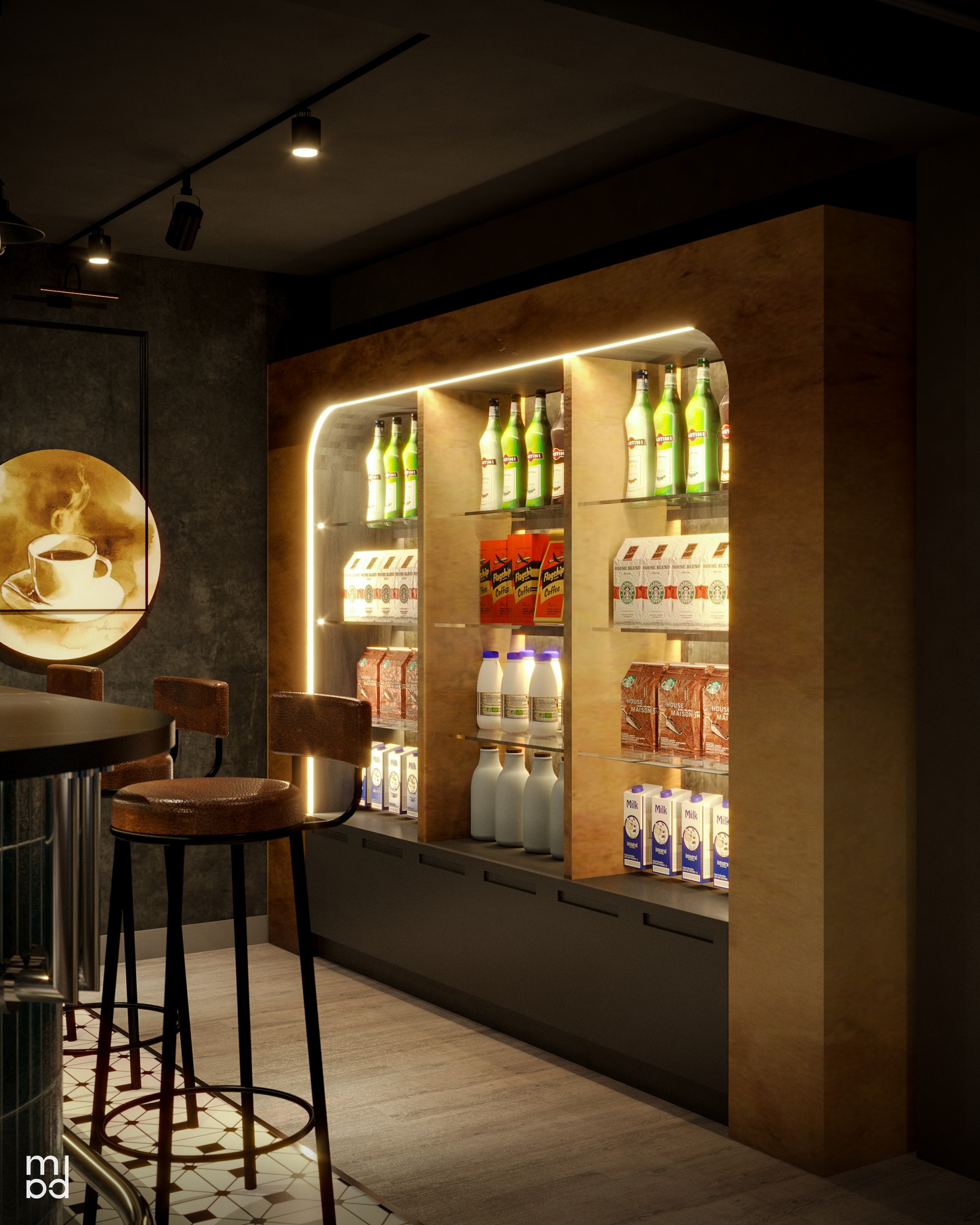
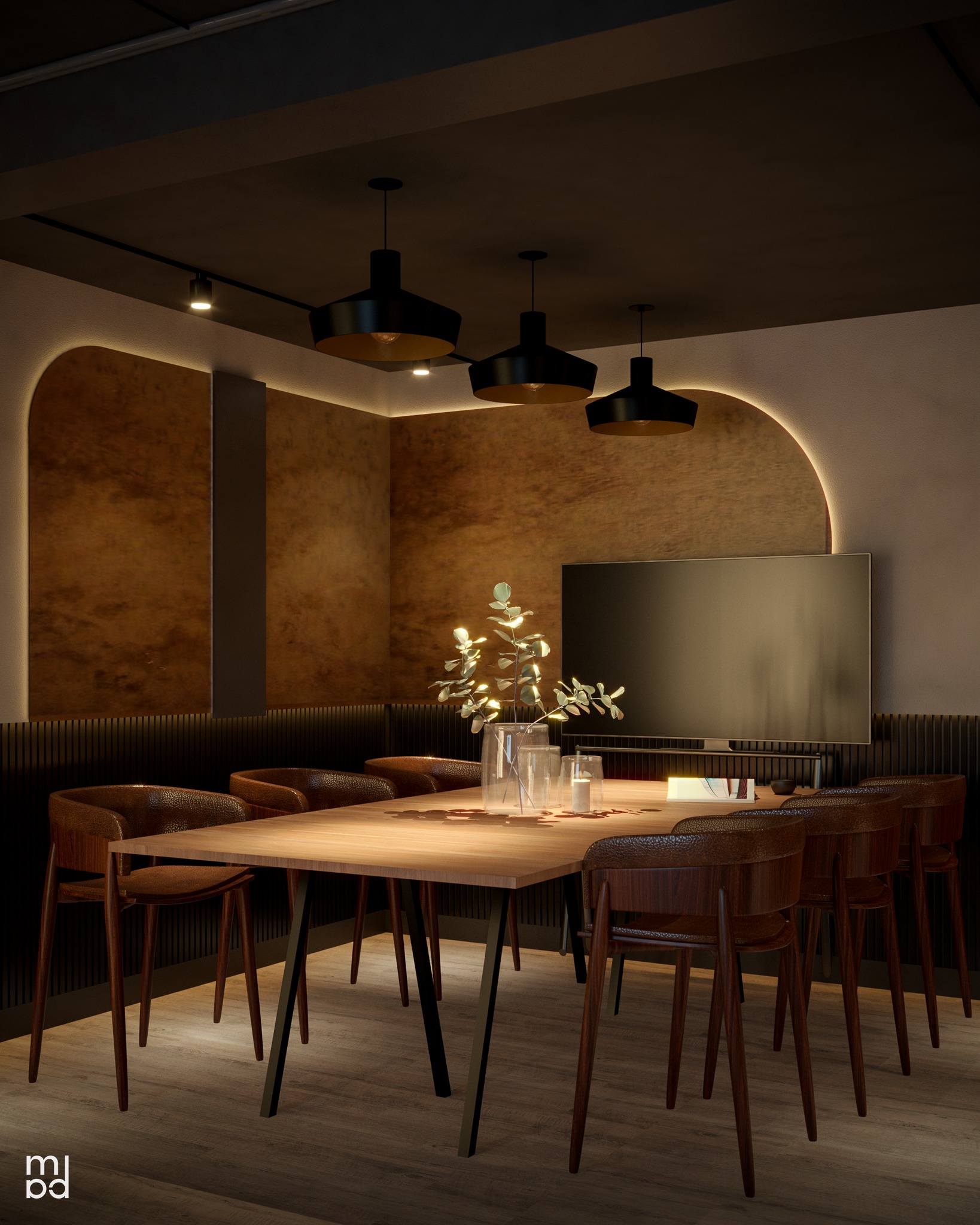
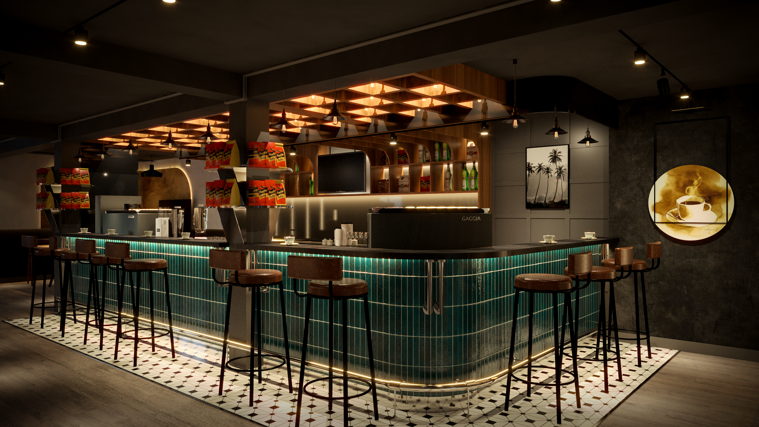
A complete makeover of a coffee tasting experience to an exclusive sophisticated journey for all the coffee business startups. By extending and redesigning the central piece of the showroom, the bar counter now accommodates up to 9 people, allowing more visitors at a time and a better consulting experience. The new interior look gives a calm classy bar impression since it is perfect for both casual and business conversations. With the dark green subway and pattern black/white floor tiles introduction, it creates a stylish and decorous scene to the whole space. Product cabinets and the rest of interior angles have been redesigned and retouched to suit the new theme we are looking for; from arch shape, grid paneling, textured wall, and color palette.
One of the other remodeling processes that might be missed by many is the lighting rework. The room lighting temperature is now on the warmer and softer side. We design a distinct ceiling light in grid pattern to complement the adjacent wall panel and counter tiling. Every cabinet shelves are well-lit and radiantly bright, necessary for product showcase and immediate attention.
